A graphic art expert’s take on beer can design
Walk into the craft beer section of any liquor store and you’ll find a dizzying array of beer can designs in all sorts of colors and styles. As an ever-increasing amount of craft breweries enter the market, can design becomes even more important, allowing the smaller players to compete for attention by visually showcasing what makes them special before you’ve even cracked a tab.
For a closer look at how Chesapeake breweries meet this cultural movement, we turned to graphic designer Nolen Strals. A co-founder of acclaimed Baltimore design studio Post Typography, he has worked with a range of clients including The New York Times, rock band Future Islands, the Maryland Film Festival and yes, a couple of breweries. His writing on design has appeared in The Washington Post and TYPE Magazine, and he’s a devoted fan of craft beer in all its forms, evidenced by his refrigerator full of smoke beers, dark lagers and wild sours.
Here is his take on can design culture and standouts around the Bay.
Nolen Strals “As open minded as craft beer culture is, I feel brands sometimes struggle to pull people in who are wary of craft beer if their cans stray too far from what people identify as beer.
The industry trend I have the biggest issue with is that so many have overwrought illustrations and look like you’re drinking a comic book. Don’t get me wrong, I love comics, but it doesn’t look like beer. Not that cans can’t be fun, and we can’t challenge and expand the aesthetics of the form, but you can go too far with it. Brands that have the best cans are following traditional forms and ideas but pushing them—and knowing how far is too far. You need to have creativity but also restraint.”
Union Craft Brewing
Baltimore, Md
“They have a standard template for core beers, like Blackwing and Duckpin, but they adapt it. The latest core beer is Divine IPA, named after the performer. It has a classic, workmanlike style of design, but this one incorporates pink because of who it’s named after. So, it’s a great reflection of Baltimore—full of weirdos but with industrial roots.”
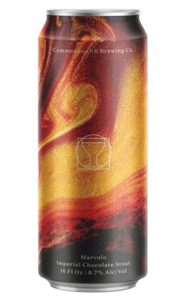
Commonwealth Brewing Co. Virginia Beach, Va
“Their cans are part of a recent trend of using abstract artwork, expressive patterns, sometimes with an almost photographic style. They do this better than some of their peers because you can always find the name on the front, and in the center of each can is their logo, a goblet. This ties into contemporary design trends but keeps it utilitarian from a buying perspective.”
RaR Brewing
Cambridge, Md
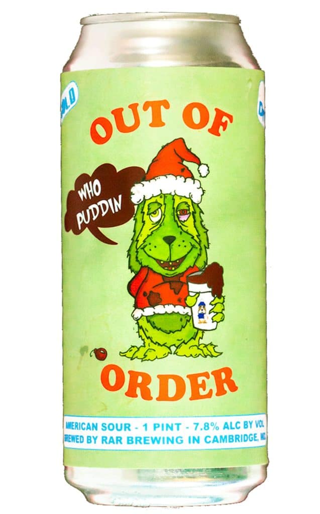
“I really like the Chessie mascot they use, and I think iconography-wise they could showcase it more. Chessie is featured nicely on the website but it would be nice to see it on more cans. They have a good series called Out of Order, which takes the dog from ICEE machines, but they redraw him to put their own spin on it each time, like making him look like the Grinch on a Christmas-time release.”
Peabody Heights Brewery
Baltimore, Md
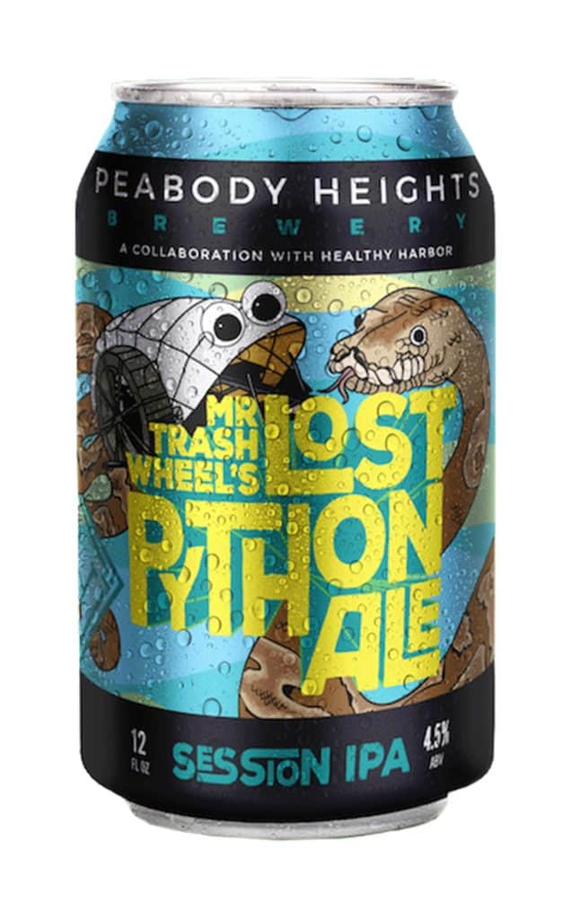
“This brand uses a standard format for layout but utilizes interesting hand lettering and color palettes so you can always tell who it is. That’s part of the success of their branding. Their core beers are part straightforward, part invention, riffing off of what you think a classic beer can should look like. It’s a nod to history with contemporary context.”
Burley Oak Brewing
Berlin, Md
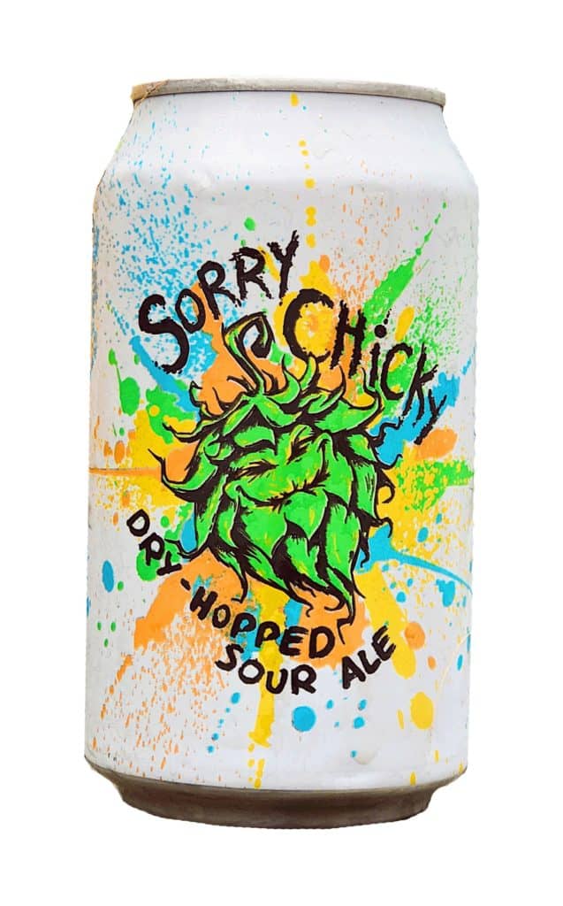
“I like their Sorry Chicky dry-hopped sour ale. It’s very colorful and the messy art is not a style of can that I’m typically drawn to, but it works so well because the art looks exactly like the beer tastes—an explosion of tartness.”
Triple Crossing Beer
Richmond, Va
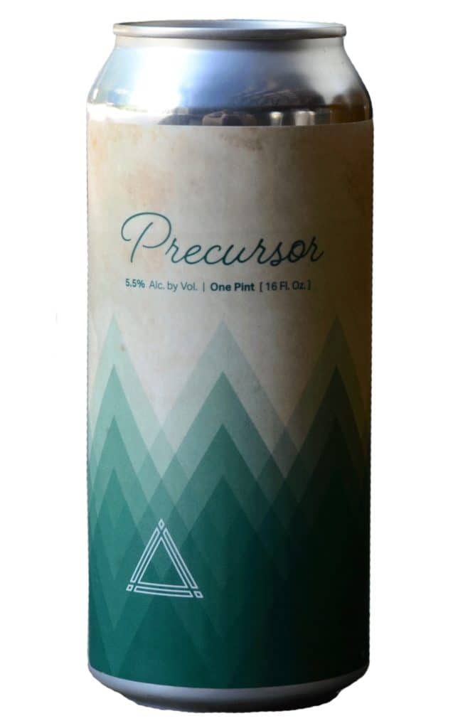
“They seem to use a few different can design styles, but my favorite of the ones I’ve seen is Precursor. It fuses the bold abstract art found on most of their cans with a more distinctive script for the beer name that matches their logotype. Plus it’s a pilsner. What’s not to like?”
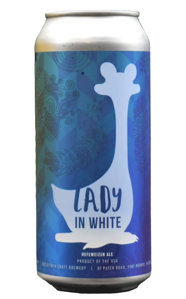
The Oozlefinch Craft Brewery
Fort Monroe, Va
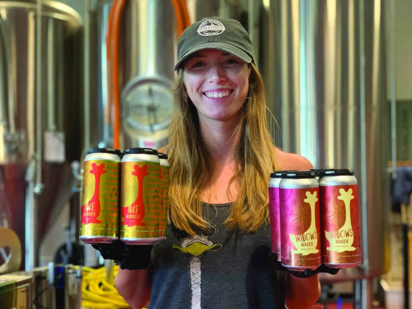
“I’m always a fan of brands and cans that reference local culture and history. This approach speaks to the community-based nature of the industry that you won’t get from the big guys. Prominently using this mythical bird they take their name from falls right in line with that, and it makes for an instantly recognizable brand on shelves.”
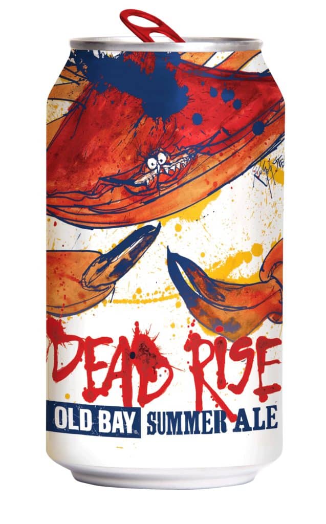
Flying Dog Brewery
Frederick, Md
“Living in this region, we’ve all seen a million renditions of the Bay’s famous crabs, but leave it to the legendary Ralph Steadman to shake up the motif by making this one [on Dead Rise] look like a psychotic mutant Muppet. I think this is one of his best efforts for Flying Dog because the subversion breathes new life into a well-worn icon.”


Nolen STRALS “As open minded as craft beer culture is, I feel brands sometimes struggle to pull people in who are wary of craft beer if their cans stray too far from what people identify as beer.
The industry trend I have the biggest issue with is that so many have overwrought illustrations and look like you’re drinking a comic book. Don’t get me wrong, I love comics, but it doesn’t look like beer. Not that cans can’t be fun, and we can’t challenge and expand the aesthetics of the form, but you can go too far with it. Brands that have the best cans are following traditional forms and ideas but pushing them—and knowing how far is too far. You need to have creativity but also restraint.”

